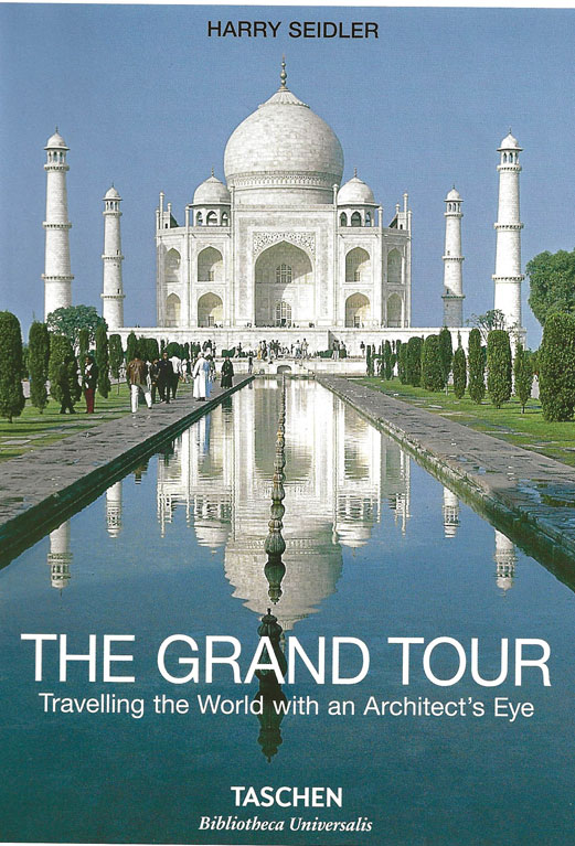
Australian Harry Seidler (1923-2006) is revered in the architecture world as an articulate exponent of modernism and an inveterate photographer who traveled the world with a Leica filled with Kodachrome film recording architectural marvels. After attending Harvard’s Graduate School of Design, he apprenticed for German Walter Gropius, founder of the Bauhaus School, and Hungarian architect and furniture designer Marcel Breuer. He then collaborated with Italian engineer Pier Luigi Nervi, a pioneer in the innovative use of reinforced concrete, and Brazilian modernist Oscar Neimeyer before helping lead the effort to retain Jorn Utzon as principal architect of the Sydney Opera House.
Seidler served as architect on many of the world’s most important modern buildings, including hundreds of skyscrapers and civic buildings, several of which are photographed in his book, The Grand Tour.
The title refers to the tour of Europe well-educated children of privilege graduating from prestigious universities would take before returning home to become young corporate executives. Today it’s called a gap year, but a century ago it was a rite of passage that allowed graduates to visit and sketch the cathedrals, castles, coliseums and palaces they had studied in books.
“Which ones have I been to?” you think, as you scan the pages of perfect pictures. “Oh, I’ve been there!” you say triumphantly every few pages. As an architect, most of my travels are planned around visiting certain buildings and waiting for people to move out of the way to take a proper photo, so many of these images look familiar. The photos are all Kodachrome-crisp, and the ever-present blue sky backdrop lends a clinical feel, like an Audubon birds print set but for buildings. The lack of people in the images makes it feel oddly like the photos were taken during quarantine.
The Italy section is expansive. “If there is one country that has continuously contributed most to Western civilization throughout the last 2000 years, it must surely be Italy”, Seidler writes. And he is right. Italy’s contributions to urban planning, architecture and structural engineering literally underlie Western society. All the typical favorites are lovingly photographed within: The Roman Colosseum, Imperial Forum, Pantheon, medieval towns and fortifications, renaissance churches, etc. Seidler pays special attention to Italian Baroque architect Francesco Borromini’s Sant Ivo and S. Carlo alle Quattro Fontane, both in Rome. Seidler writes that these churches “achieved a structural virtuosity by geometrically minimal means,” with “arched interiors whose rib elements narrow and deepen toward the top of the domes, recognizing intuitively that greater stiffness is needed there…”
Seidler ends his chapter with the beautiful geometric ceiling of the Palazetto dello Sport, an arena Seidler worked on with Pier Luigi Nervi, a work experience of which he is clearly proud. He describes the Palazetto as having “deeply satisfying aesthetics,” in that “the static laws of nature are made evident and are given form without any painterly or sculptural embellishments.” He pays Nervi the ultimate compliment, dubbing him the “structural descendent of Borromini.” Nervi’s work represents the “high point of expressive engineering in the 20th century” – the mantle of genius continues to pass through Italy’s architectural continuum. Seidler’s love for Italian architecture feels familiar to anyone who has traveled there and also fallen in love with it.
I studied Classics undergrad before spending a semester in Rome and moving on to get my Architecture Masters. Reading the great works in Latin and Greek made me aware that people thousands of years ago were every bit as intelligent as we are today, if not more so. Just as languages in polar climates develop more complex ways to describe snow, Greek and Latin seem to provide more ways to describe thought. Though translations might be tough to render to modern readers with full precision, the philosophies and teachings of brilliant ancient minds are preserved for posterity in these writings.
Traveling in Rome, brought this idea into three dimensions for me. The great polymaths of Italy, from the Roman engineers through the Renaissance artist and architects, were able to create structures of such beauty, strength, and value that they remain celebrated today. No translation is needed to understand that a great mind designed the Pantheon. You don’t need to tell me Michelangelo was a genius; the evidence is there for us to see and will be there for centuries more. For a student wondering how to make their mark on the world, this was a profound realization.
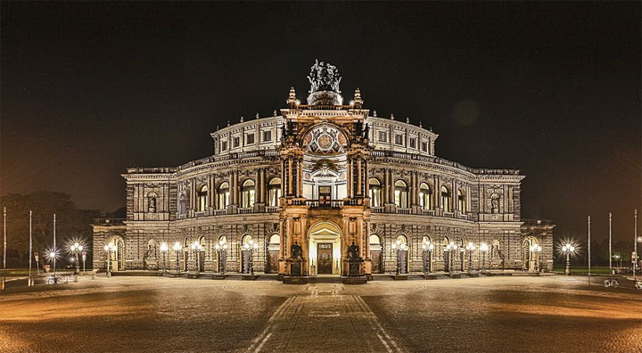
The Germany section takes us through the elaborate ceilings of the Balthasar Neuman churches of the 1700s (another Borromini structural descendent), the Dresden Opera house (1878) by Gottfried Semper (faithfully reconstructed but not until 1985), and through the Bauhaus works of Behrens and Gropius (Seidler’s teacher at Harvard). It reveals a tidal shift in architecture to see the heavy stone facades of the baroque neoclassical buildings of the 1870s and then turn the page to find the glass curtain walls of the Bauhaus factories a mere 30 years later. I check to see if Seidler included any Nazi-era buildings like Berlin’s Olympic Stadium…he didn’t.
The shift in architecture from heavy historicism to light modernism was propelled by more than just aesthetics. The flat roofs, balconies, walls of glazing, and gardens were a reaction to a health crisis, not unlike what we are experiencing today. Cholera and later Tuberculosis ravaged 18th and 19th century Europe and architects adapted to design more “livable” spaces. Fresh air and heliotherapy (sunshine) were promoted as preventative and restorative. As cities began to rebuild after the massive destruction of WWI, a new ethos of healthy design took root. In Germany, the Weissenhaufseidlung (1927) by Mies Van Der Rohe and Le Corbusier sought to redefine a hygienic workplace. In France, Corbusier designs Villa Savoye as a machine for healthy living. And in Los Angeles, Neutra’s Lovell Health House (1928) sets the stage for the next century of indoor-outdoor spaces in modern architecture.
Will today’s Coronavirus inspire a new wave of hygienic design? Will touchless faucets, and self-sanitizing, antimicrobial surfaces replace material palettes that allow viruses to survive? Will the service industry go touchless? Will virtual environments feel more natural to us as we spend more time at home?
The Spain section winds through hill towns and psychedelic Gaudi facades and ends with the Frank Gehry’s Guggenheim Bilbao, a building that changes the entire economy of the region and ushers in the age of the modern “starchitect.” I’m happy to see the spectacular central atrium represented as well as the typical exterior image. It’s the main interior space that is really the mind-bending part of this building. Visitors walk in and look up and around for minutes as their brains try to digest the geometry of the space.
Seidler’s travels in the Middle East take us through Iran, Israel, and Jordan. Petra is recorded quite well. The lost Nabatean city of Petra was only rediscovered in 1812 so it wouldn’t have been on the original Grand Tour for many of the European aristocrats of the 18th century. There is probably no discovery in history that would have been more archaeologically exciting than rediscovering Petra, an experience that all visitors can experience. You wind through a lengthy sandstone slot canyon with water channels carved into the side, and suddenly the Treasury building dramatically emerges before you (if you have seen Indiana Jones and the Last Crusade you will be familiar with this reveal). If you haven’t been to Petra, you may not be aware of the many other parts of the city, all carved into the sandstone. Seidler does well to show photos from all over the site.
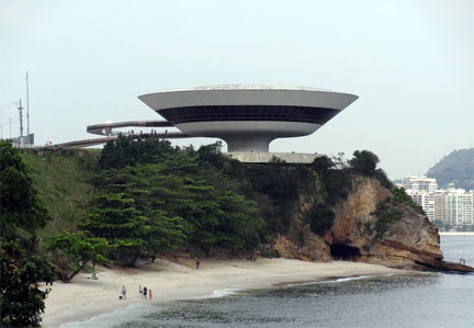
Seidler also spent some time working with Oscar Neimayer in Brazil. He photographs Neimayer’s civic buildings in Brasilia and Sao Paulo, but reserves his highest praise for the Niteroi Contemporary Art museum: “This daring concept and structure is beyond belief or description. After a visit one feels confident that there is hope for our time.” This inventive and sculptural masterpiece was built when Neimayer was over 90 years old. Perhaps no architect has created designs that speak more to their culture than Neimayer, with logical, industrial concrete forms in the capitals and sensual organic shapes near the beach.
In Japan, Seidler takes us with him from the temples and palaces of Kyoto to the ingenious concrete forms of Kenzo Tange in Tokyo. Any student or lover of architecture needs to visit Japan. A glance at the included floor plan of Katsura Rikyu Imperial Villa in Kyoto reminds me that traditional Japanese architecture is as close to design perfection as you can get. Unburdened from having to incorporate today’s ever-changing modern technological conveniences, traditional Japanese palace architecture allows the buildings to be a series of perfectly proportioned spaces, with large covered verandas connected to inner rooms through sliding screens to comfortably enjoy nature – rain or shine, publicly or privately. The most interesting section for me contains photos of Frank Lloyd Wright’s Imperial Hotel, a masterpiece building that strangely has very few photos lurking about on the internet. Seidler examines the details and includes a photo of the seven-level entrance hall that I’ve never seen before.
Seidler travels briefly through Thailand, China, Indonesia, and Cambodia. I stop to see what he’s written on Angkor Wat, the most impressive place I’ve ever been. Angkor wat is photogenic, but it’s impossible to tell from a photo the incredible scale of the complex, or the detailed carved reliefs that cover almost every surface. Angkor Wat’s mandala-like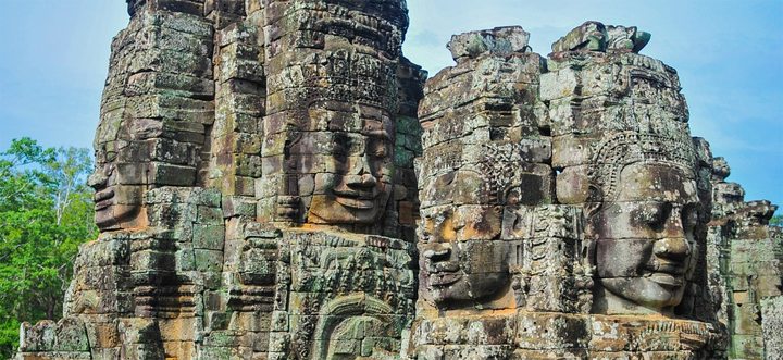 concentric square floor plan that Seidler includes gives you a good idea of how beautiful this building must be but there is just so much that photos can’t capture. The rooms separated by a series of low lintels that force a visitor to bow as they proceed, is a beautiful example of the interplay of architecture and human experience. The porous basalt foundations that allow water to pass through but remain structurally strong enough to support the sandstone and laterite above represents a genius use of materials that has allowed the buildings to survive through the centuries. And no photo can capture the experience of the chamber of Echoes at Ta Prohm, a room with perfect acoustic construction. You enter the stone chamber, open to the sky above, stand against the wall and bang your chest. Instead of a dull thud, you hear and feel a loudly resonating “bong”, as if the building and you blend together to form an instrument (Tough to photograph!).
The USA section is heavy with the works of Frank Lloyd Wright but also includes the signature works of IM Pei, Philip Johnson, SOM, Marcel Breuer, Neutra, Richard Meier, etc. The section ends with the World Trade Center and a reflection about its collapse:
“When visiting the buildings during construction in 1970, I remember being amazed at the exclusive use of lightweight building materials. Their steel structure consisted of closely spaced exterior columns and 20m floor beams spanning to the elevator core. No concrete was used around firestairs or elevator shafts; instead, layers of plasterboard were chosen. The immense heat generated by the explosion of jet fuel on impact weakened the steel structure to such an extent that it caused the progressive collapse of both towers in a short time. Nevertheless, the structural steel design of the buildings is ingenious and given normal usage would have lasted indefinitely, excluding such an outrageous terrorist attack. My contention remains, however, that concrete buildings would have been damaged by the impact but would not have collapsed.”
As an aside, my Structures professor in Architecture school told a story about a conversation he had with Minoru Yamasaki and Leslie Robertson, the primary architect and structural engineer of the World Trade center buildings. He recalled them being proud that their calculations showed that the buildings would survive the impact of a 707 airplane, the largest commercial craft at the time. And technically, they did survive the impact, just not the subsequent fires. Yamasaki died before the attack on 9/11, but Leslie Robertson is still alive, and takes some solace in the fact that the buildings did stand long enough to allow many thousands to survive.
This book is a great escape. It’s a reminder of what the human mind is capable of and an example of how the intelligence of different cultures are interdependent and synergistic. Just as good ideas spread so do good designs and structural strategies. This book is more than just a travel slideshow, it’s the lens that one of the greatest architects of the 20th century appreciated human ingenuity and learned from his predecessors through. And if these photos and angles look familiar to you, we’ve all stood in the exact same places, filled with similar thoughts of inspiration and wonder.
Thomas DeVoss is a Los Angeles architect and former design team leader with Frank Gehry Partners. For more on DeVoss see http://edificecomplex.tumblr.com/ and http://deap.space/


